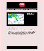
For this project we got to make a website but instead of doing desktop first we did mobile first. In the picture to the left you can see I was going for a little bit to much with trying to put the pictures next to it, so I simplified that and just put them on their own line or got rid of them all together. I wanted the page to flow and not look cluttered so I only went for the most important information and most important functions. I like how it came out because it doesn't look to busy and it's straight to the point, with no confusing features.

Both on the tablet and desktop form I decided to leave it the same as the mobile just larger which might sound weird, but I think it works. I didn't want to add to much because I didn't want it to become cluttered and the easiest way to do that is leave it as the most simplified version. I also like how everything a person would need to look at can be easily found by scrolling down and not by going through like five other pages to find this one little piece of information like the contact info. I did try messing with the tablet and desktop form of the website, but none of the changes I made made the website look better they just looked distracting and out of place. Their actual website is to cluttered and distracting as it is anyway so I made it look the simplest it could and only had the most need to know information.


Comments
Post a Comment