Responsive Websites
Responsive Web Design
Responsive web design is making a website available and easy to use on all types of devices, for example tablets, phones, and computers. Responsive web design has become very important over the years, the reason being the evolution of mobil devices. More people use their phones to visit websites, instead of using a laptop or computer. A media query is a what you would use if you were going to be displaying your website on a phone or small device. It only goes into affect the browser gets to a small enough width. Breakpoints are used to change the layout of the website when you have a small enough width (phones).
Example Website: Starbucks
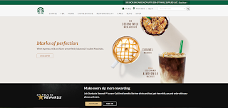
As you can see when the site is at max width the type is large, the images are large, the menu goes across the top of the screen, and everything is large and easy to read.
 In this medium view of the website you can tell that the pictures are larger and so are the words. The menu along the top almost goes across the whole page and the layout stayed the same.
When you got to a narrow view, you can tell a lot of things changed, the text and images are still fairly large. But the layout has changed, the menu is now a drop down menu. The search bar became a button, the discover wet from being on the left of the image to under the images.
(link is the word Starbucks)


Comments
Post a Comment